Exploring plotly chart types with examples

Plotly is a powerful Python library for creating interactive and visually appealing charts.
It supports a variety of chart types, catering to diverse data visualization needs.
This guide showcases some of the most common chart types available in Plotly, along with implementation examples.

All examples presented below were created using references from Plotly tutorial page


Chart Types

Chart Types

  1. Line Chart
  2. Scatter Plot
  3. Bar Chart
  4. Pie Chart
  5. Box Plot
  6. Heatmap
  7. Histogram
  8. Bubble Chart
  9. Area Chart
  10. Contour Plot
  11. 3D Surface Plot
  12. Candlestick Chart
  13. OHLC Chart
  14. Violin Plot
  15. Choropleth Map
  16. Scatter Map
  17. Sunburst Chart
  18. Treemap Chart
  19. Parallel Coordinates Plot

Line Chart

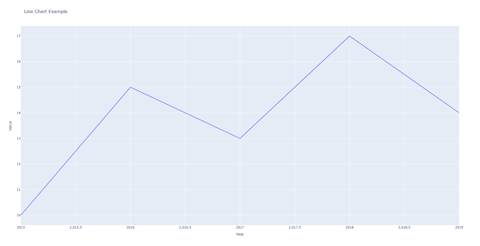
A line chart is ideal for visualizing data trends over time, with data points connected by straight lines.


1
2
3
4
5
6
7
import plotly.express as px  

def line_chart():
"""A line chart is ideal for visualizing data trends over time, with data points connected by straight lines."""
data = {'Year': [2015, 2016, 2017, 2018, 2019], 'Value': [10, 15, 13, 17, 14]}
fig = px.line(data, x='Year', y='Value', title='Line Chart Example')
fig.show()


Scatter Plot

Go to >> Chart Types list
1
2
3
4
5
def scatter_plot():
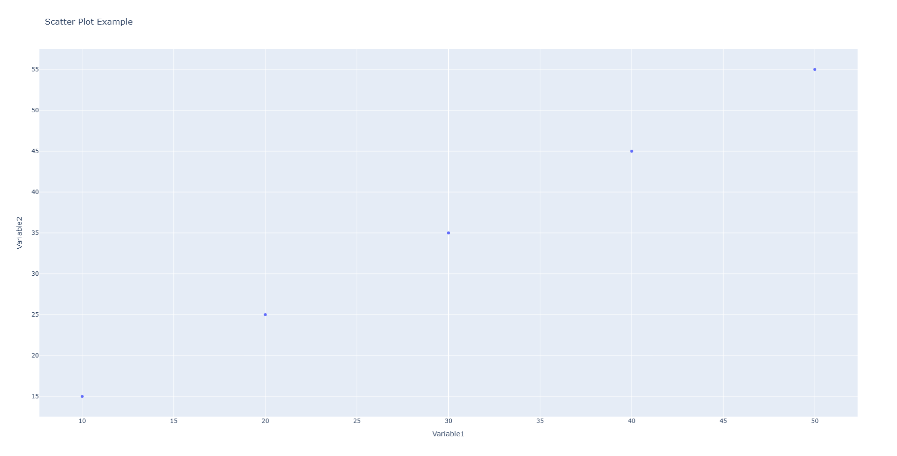
"""A scatter plot displays the relationship between two numerical variables using dots."""
data = {'Variable1': [10, 20, 30, 40, 50], 'Variable2': [15, 25, 35, 45, 55]}
fig = px.scatter(data, x='Variable1', y='Variable2', title='Scatter Plot Example')
fig.show()

Bar Chart

Go to >> Chart Types list
1
2
3
4
5
def bar_chart():
"""Bar charts are used to compare categorical data, with rectangular bars representing values."""
data = {'Category': ['A', 'B', 'C', 'D'], 'Value': [10, 20, 30, 40]}
fig = px.bar(data, x='Category', y='Value', title='Bar Chart Example')
fig.show()

Pie chart

Go to >> Chart Types list
1
2
3
4
5
def pie_chart():
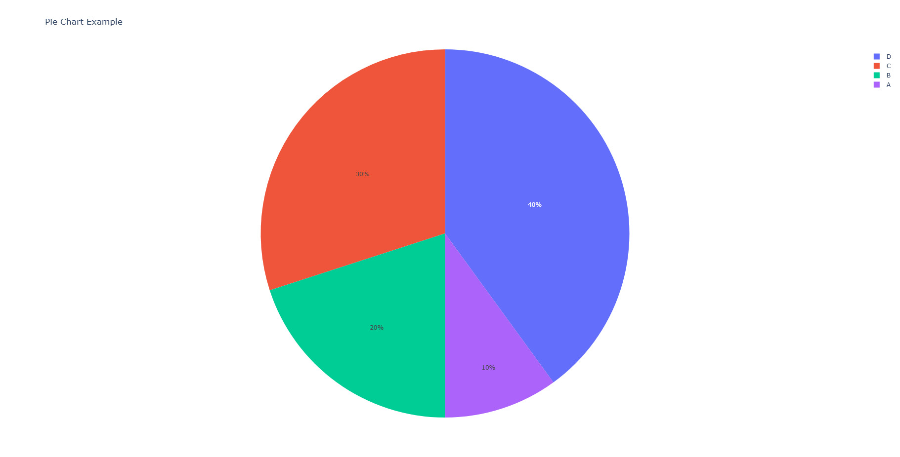
"""A pie chart divides data into slices to illustrate proportions."""
data = {'Category': ['A', 'B', 'C', 'D'], 'Value': [10, 20, 30, 40]}
fig = px.pie(data, names='Category', values='Value', title='Pie Chart Example')
fig.show()

Box Plot

Go to >> Chart Types list
1
2
3
4
5
def box_plot():
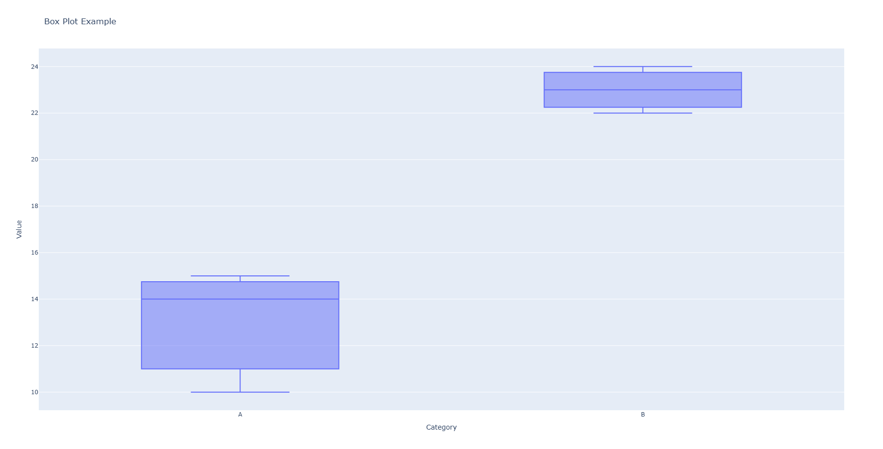
"""Box plots summarize data distribution through their quartiles, highlighting outliers."""
data = {'Category': ['A', 'A', 'A', 'B', 'B', 'B'], 'Value': [10, 15, 14, 22, 24, 23]}
fig = px.box(data, x='Category', y='Value', title='Box Plot Example')
fig.show()

Heatmap

Go to >> Chart Types list
1
2
3
4
5
6
def heatmap():
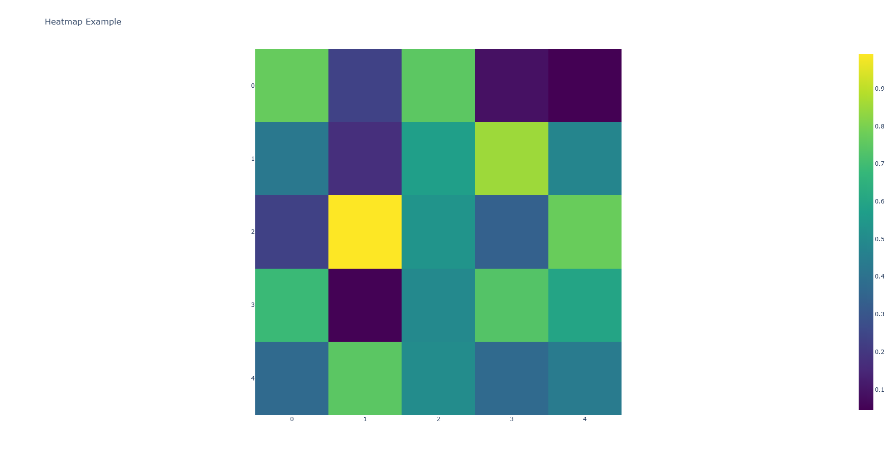
"""Heatmaps display data intensity using varying colors in a grid layout."""
data = np.random.rand(5, 5)
fig = px.imshow(data, color_continuous_scale='Viridis', title='Heatmap Example')
fig.show()


Histogram

Go to >> Chart Types list
1
2
3
4
5
def histogram():
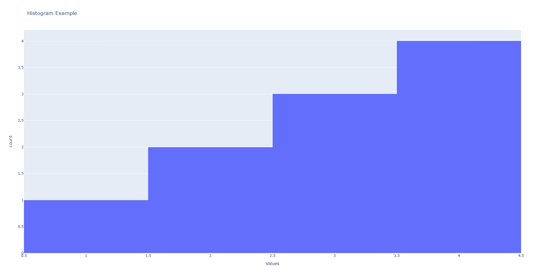
"""Histograms display the distribution of a dataset by grouping data into bins."""
data = {'Values': [1, 2, 2, 3, 3, 3, 4, 4, 4, 4]}
fig = px.histogram(data, x='Values', title='Histogram Example')
fig.show()

Bubble Chart

Go to >> Chart Types list
1
2
3
4
5
def bubble_chart():
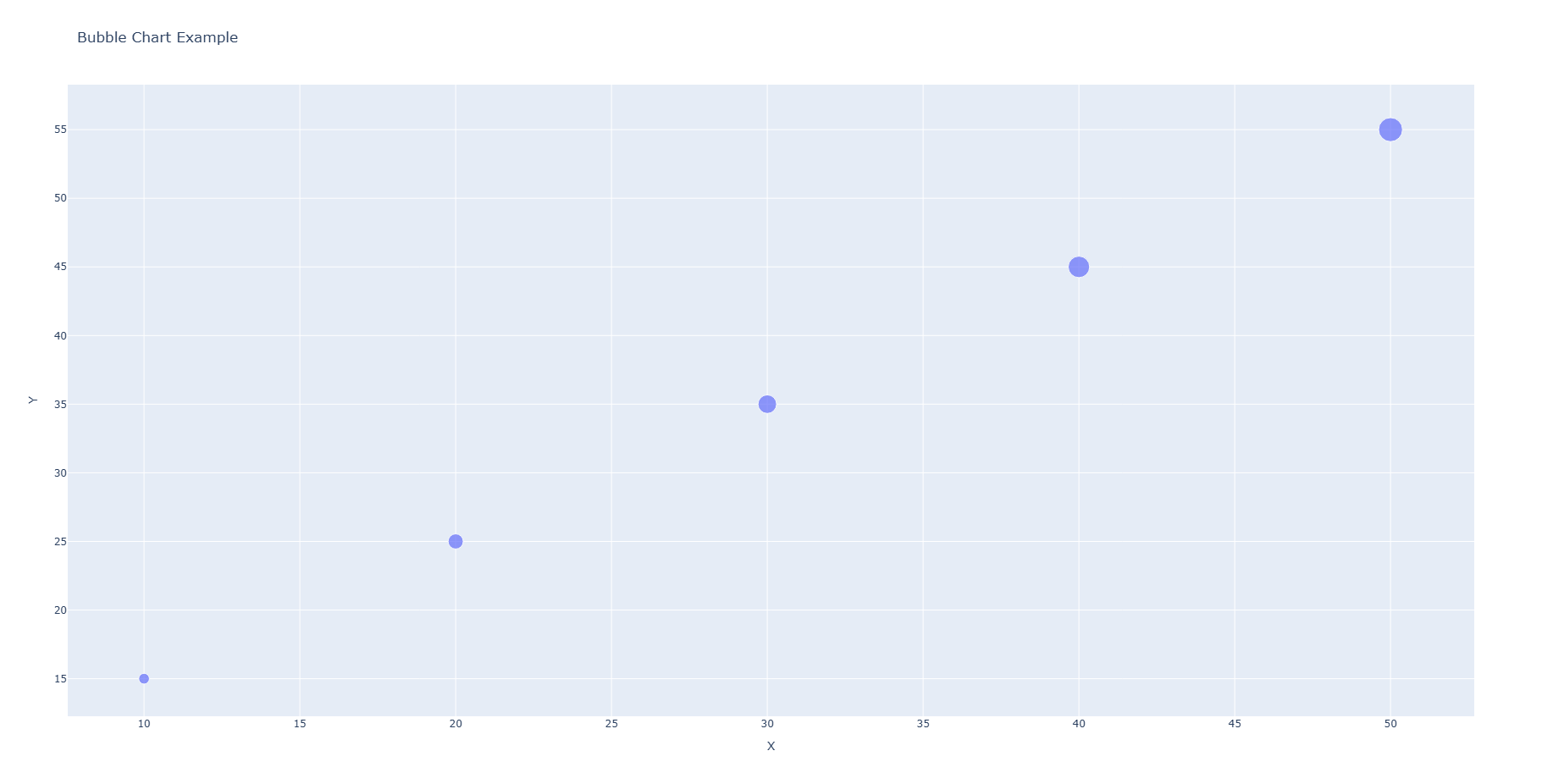
"""Bubble charts extend scatter plots with a third dimension using bubble size."""
data = {'X': [10, 20, 30, 40, 50], 'Y': [15, 25, 35, 45, 55], 'Size': [100, 200, 300, 400, 500]}
fig = px.scatter(data, x='X', y='Y', size='Size', title='Bubble Chart Example')
fig.show()

Area chart

Go to >> Chart Types list
1
2
3
4
5
6
def area_chart():
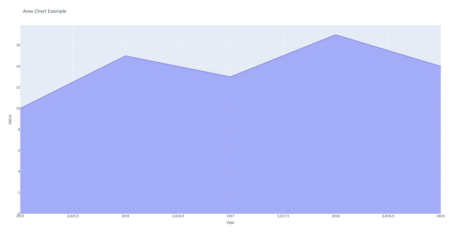
"""Area charts show quantitative data over time, emphasizing magnitude."""
data = {'Year': [2015, 2016, 2017, 2018, 2019], 'Value': [10, 15, 13, 17, 14]}
fig = px.area(data, x='Year', y='Value', title='Area Chart Example')
fig.show()


Contour Plot

Go to >> Chart Types list
1
2
3
4
5
6
7
8
9
10
11
12
13
14
15
16
17
def contour_plot():
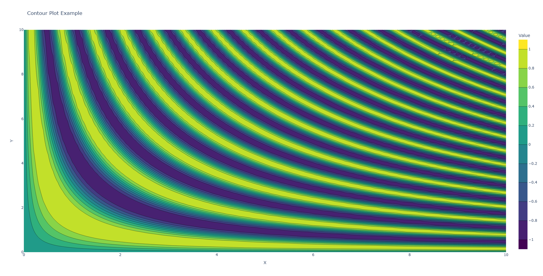
"""Contour plots display three-dimensional data in two dimensions with contour lines."""
x = np.linspace(0, 10, 100)
y = np.linspace(0, 10, 100)
z = np.sin(x[:, None] * y[None, :])

# Create a contour plot using go.Contour
fig = go.Figure(go.Contour(
z=z,
x=x,
y=y,
colorscale='Viridis',
colorbar=dict(title="Value"),
))

fig.update_layout(title='Contour Plot Example', xaxis_title="X", yaxis_title="Y")
fig.show()

3D surface plot

Go to >> Chart Types list
1
2
3
4
5
6
7
8
9
10
11
12
def three_d_surface_plot():
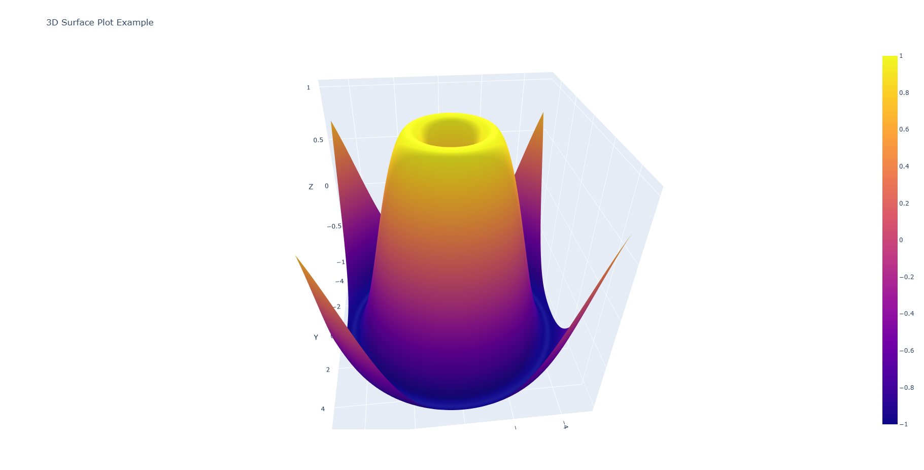
"""3D surface plots provide a three-dimensional representation of data, showing relationships in three dimensions."""
x = np.linspace(-5, 5, 100)
y = np.linspace(-5, 5, 100)
x, y = np.meshgrid(x, y)
z = np.sin(np.sqrt(x ** 2 + y ** 2))

fig = go.Figure(data=[go.Surface(z=z, x=x, y=y)])
fig.update_layout(title='3D Surface Plot Example',
scene={'xaxis_title': 'X', 'yaxis_title': 'Y', 'zaxis_title': 'Z'})
fig.show()


Candlestick Chart

Go to >> Chart Types list
1
2
3
4
5
6
7
8
9
10
11
12
13
14
15
def candlestick_chart():
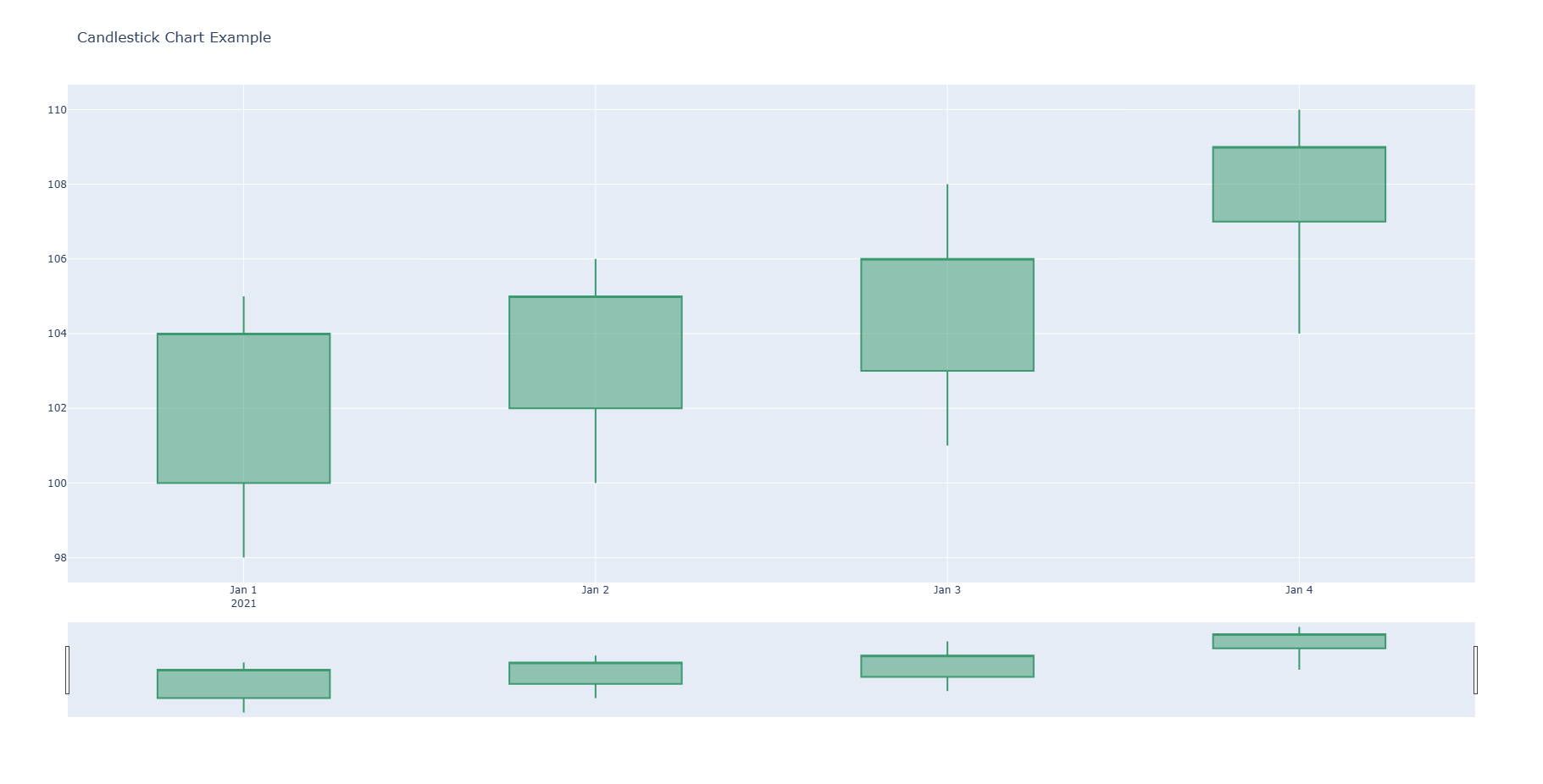
"""Candlestick charts are used to visualize stock price movements over time, displaying the opening, closing, high, and low prices."""
data = {
'Date': ['2021-01-01', '2021-01-02', '2021-01-03', '2021-01-04'],
'Open': [100, 102, 103, 107],
'High': [105, 106, 108, 110],
'Low': [98, 100, 101, 104],
'Close': [104, 105, 106, 109]
}

fig = go.Figure(
data=[
go.Candlestick(x=data['Date'], open=data['Open'], high=data['High'], low=data['Low'], close=data['Close'])])
fig.update_layout(title='Candlestick Chart Example')
fig.show()

OHLC

Go to >> Chart Types list
1
2
3
4
5
6
7
8
9
10
11
12
13
14
15
def ohlc_chart():
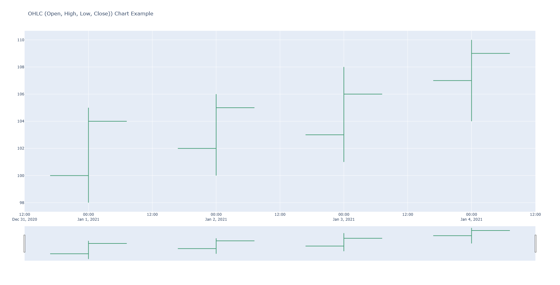
"""OHLC (Open, High, Low, Close) charts are used for visualizing financial data with four key values for each period."""

data = {
'Date': ['2021-01-01', '2021-01-02', '2021-01-03', '2021-01-04'],
'Open': [100, 102, 103, 107],
'High': [105, 106, 108, 110],
'Low': [98, 100, 101, 104],
'Close': [104, 105, 106, 109]
}

fig = go.Figure(
data=[go.Ohlc(x=data['Date'], open=data['Open'], high=data['High'], low=data['Low'], close=data['Close'])])
fig.update_layout(title='OHLC (Open, High, Low, Close)) Chart Example ')
fig.show()

Violin plot

Go to >> Chart Types list
1
2
3
4
5
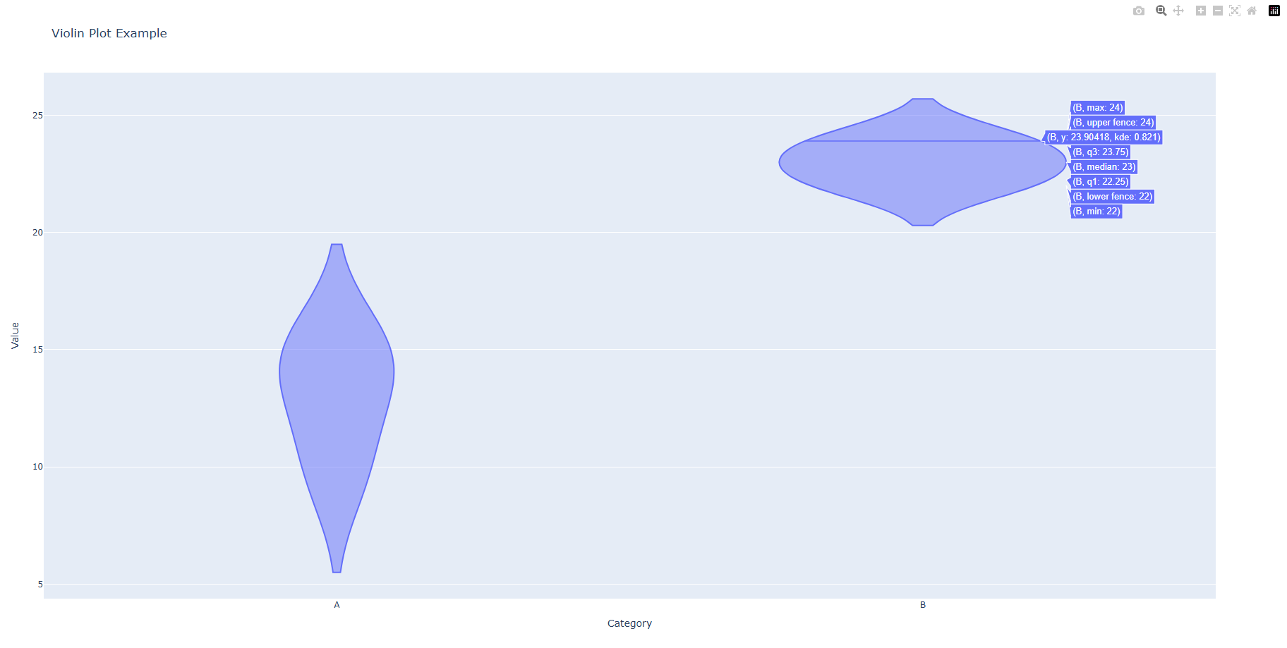
def violin_plot():
"""Violin plots combine aspects of box plots and density plots to display data distribution."""
data = {'Category': ['A', 'A', 'A', 'B', 'B', 'B'], 'Value': [10, 15, 14, 22, 24, 23]}
fig = px.violin(data, x='Category', y='Value', title='Violin Plot Example')
fig.show()

Choropleth Map

Go to >> Chart Types list
1
2
3
4
5
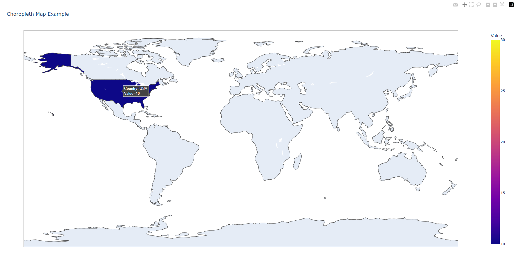
def choropleth_map():
"""Choropleth maps visualize data geographically, with color shading to represent values."""
data = {'Country': ['USA', 'Canada', 'Mexico'], 'Value': [10, 20, 30]}
fig = px.choropleth(data, locations='Country', color='Value', title='Choropleth Map Example')
fig.show()

Scatter Map

Go to >> Chart Types list
1
2
3
4
5
6
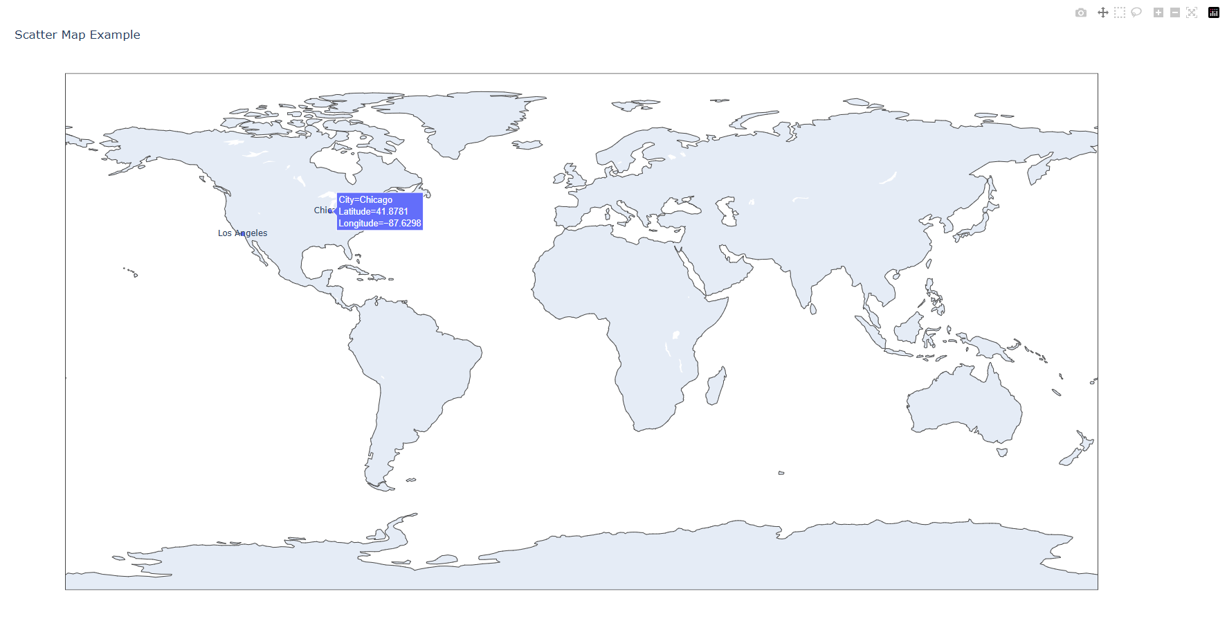
def scatter_map():
"""Scatter maps visualize geographical data with points plotted on a map."""
data = {'Latitude': [34.0522, 40.7128, 41.8781], 'Longitude': [-118.2437, -74.0060, -87.6298],
'City': ['Los Angeles', 'New York', 'Chicago']}
fig = px.scatter_geo(data, lat='Latitude', lon='Longitude', text='City', title='Scatter Map Example')
fig.show()

Sunburst chart

Go to >> Chart Types list
1
2
3
4
5
6
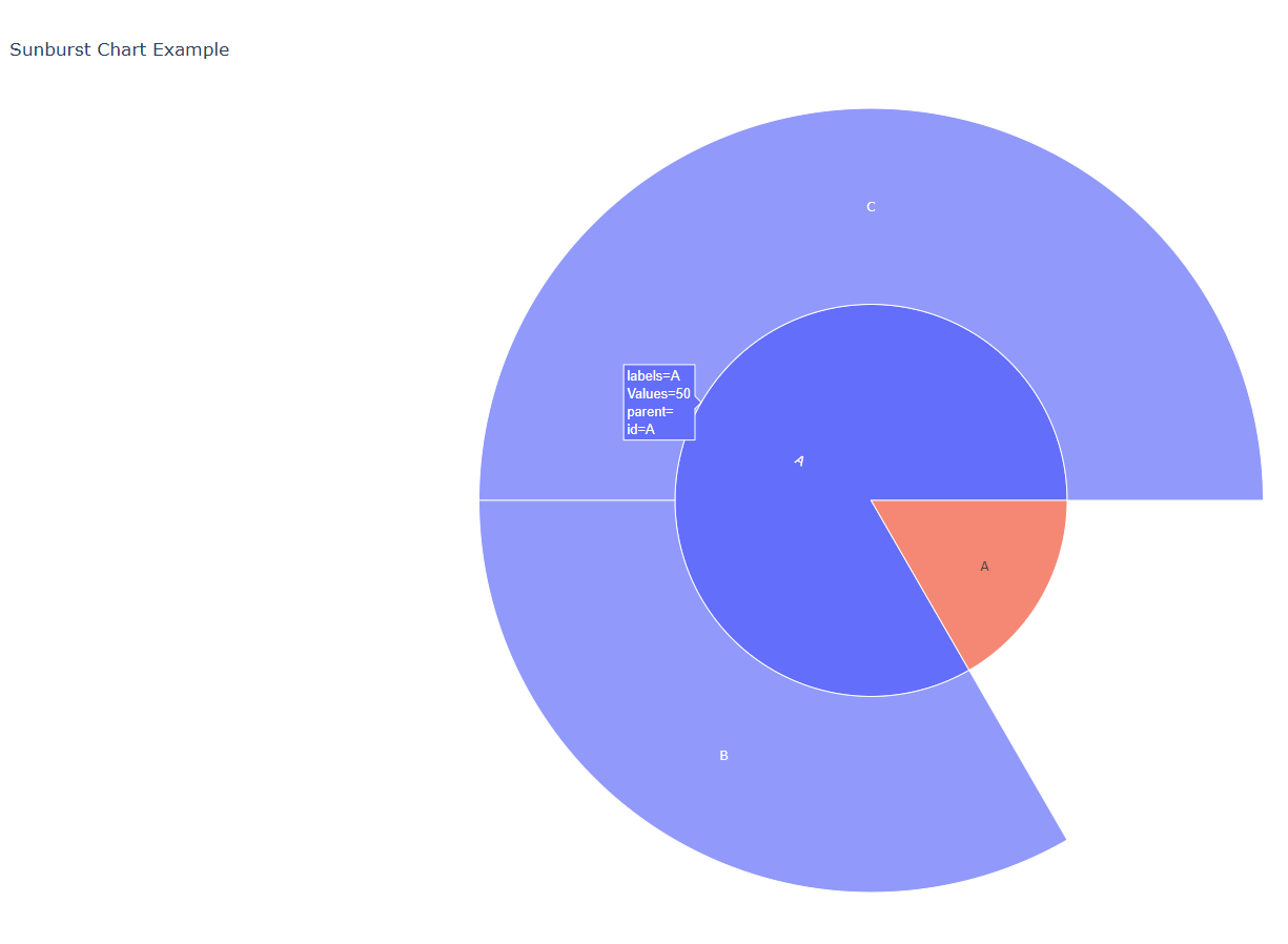
def sunburst_chart():
"""Sunburst charts visualize hierarchical data with a circular layout."""
data = {'Labels': ['A', 'B', 'C'], 'Parents': ['', 'A', 'A'], 'Values': [10, 20, 30]}
fig = px.sunburst(data
, path=['Parents', 'Labels'], values='Values', title='Sunburst Chart Example')
fig.show()

Treemap Chart

Go to >> Chart Types list
1
2
3
4
5
def treemap_chart():
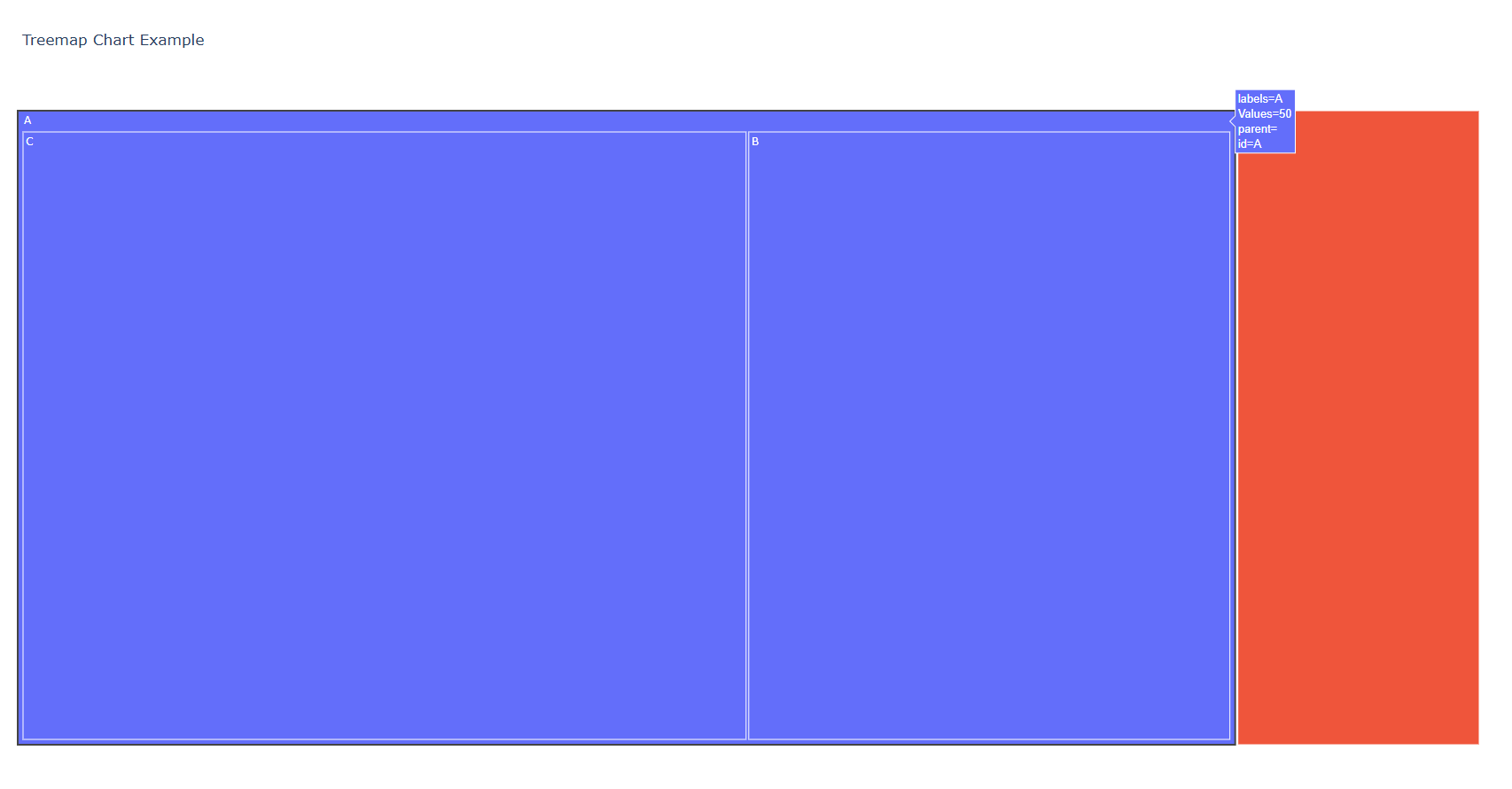
"""Treemaps display hierarchical data as nested rectangles, with size and color indicating values."""
data = {'Labels': ['A', 'B', 'C'], 'Parents': ['', 'A', 'A'], 'Values': [10, 20, 30]}
fig = px.treemap(data, path=['Parents', 'Labels'], values='Values', title='Treemap Chart Example')
fig.show()

Parallel Coordinates Plot

Go to >> Chart Types list
1
2
3
4
5
def parallel_coordinates_plot():
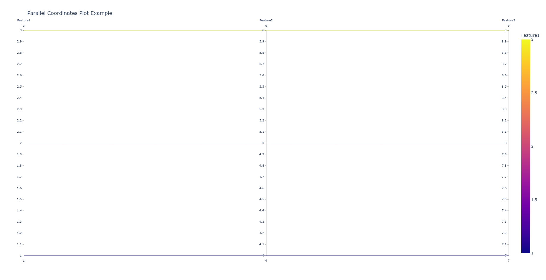
"""Parallel coordinates plots are used to visualize multivariate data by plotting variables on parallel axes."""
data = {'Feature1': [1, 2, 3], 'Feature2': [4, 5, 6], 'Feature3': [7, 8, 9]}
fig = px.parallel_coordinates(data, color='Feature1', title='Parallel Coordinates Plot Example')
fig.show()