HEXIO.IO layout improvements

Table of content


Decreasing size of main body area

header-inner (section that contains elements of navigation menu)

Edited file \themes\landscape\source\css\_partial\header.styl

Before changes #header-inner

1
2
3
#header-inner
position: relative
overflow: hidden

Before changes $nav-link

1
2
3
4
5
6
7
8
9
10
11
12
13
14
15
16
17
18
19
20
$nav-link {
float: left;
color: #312602;
opacity: 0.6;
text-decoration: none;
text-shadow:
-1px -1px 0 #ff7f50, // Top-left shadow
1px -1px 0 #ff7f50, // Top-right shadow
-1px 1px 0 #ff7f50, // Bottom-left shadow
1px 1px 0 #ff7f50, // Bottom-right shadow
1px 1px 2px rgba(0, 0, 0, 0.4); // Original shadow for depth

transition: opacity 0.2s;
display: block;
padding: 20px 15px;

&:hover {
opacity: 1;
}
}

changes-1

After changes-1 #header-inner

1
2
3
4
5
6
7
#header-inner {
position: absolute;
bottom: 0; // Move to the bottom of the parent section
left: 0; // Align to the left if needed
width: 80%; // Ensure it spans the width of the parent section
overflow: hidden;
}

Links on the nav bar are not possible to click

changes-2

After changes-2 #header-inner

1
2
3
4
5
6
7
8
#header-inner {
position: absolute;
bottom: 0; // Move to the bottom of the parent section
left: 0; // Align to the left if needed
width: 80%; // Ensure it spans the width of the parent section
z-index: 10; // Ensure it is above other elements
}

and

After changes-2 $nav-link

1
2
3
4
5
6
7
8
9
10
11
12
13
14
15
16
17
18
19
20
21
22
$nav-link {
float: left;
color: #312602;
opacity: 0.6;
text-decoration: none;
text-shadow:
-1px -1px 0 #ff7f50, // Top-left shadow
1px -1px 0 #ff7f50, // Top-right shadow
-1px 1px 0 #ff7f50, // Bottom-left shadow
1px 1px 0 #ff7f50, // Bottom-right shadow
1px 1px 2px rgba(0, 0, 0, 0.4); // Original shadow for depth

transition: opacity 0.2s;
display: block;
padding: 20px 15px;
position: relative; // Ensures correct stacking within #header-inner

&:hover {
opacity: 1;
cursor: pointer; // Ensures pointer cursor on hover
}
}

nav-bar fixed and works fine for desktop and mobile view.

Layout of Search form is shifted for mobile devices.
File \themes\landscape\source\css\_partial\header.styl
should be changed

Before changes-1 header.styl

1
2
3
4
5
6
7
8
9
10
11
12
13
14
15
16
17
18
19
20
21
22
23
24
25
26
27
28
29
30
31
32
33
34
35
36
37
38
39
40
41
42
43
44
45
46
47
48
49
50
51
52
53

#sub-nav
float: right
margin-right: -15px

#search-form-wrap
position: absolute
top: 15px
width: 150px
height: 30px
right: -150px
opacity: 0
transition: 0.2s ease-out
&.on
opacity: 1
right: 0
@media mq-mobile
width: 100%
right: -100%

.search-form
position: absolute
top: 0
left: 0
right: 0
background: #fff
padding: 5px 15px
border-radius: 15px
box-shadow: 0 0 10px rgba(0, 0, 0, 0.3)

.search-form-input
border: none
background: none
color: color-default
width: 100%
font: 13px font-sans
outline: none
&::-webkit-search-results-decoration
&::-webkit-search-cancel-button
-webkit-appearance: none

.search-form-submit
position: absolute
top: 50%
right: 10px
margin-top: -7px
font: 13px font-icon
border: none
background: none
color: #bbb
cursor: pointer
&:hover, &:focus
color: #777

after changes-1

1
2
3
4
5
6
7
8
9
10
11
12
13
14
15
16
17
18
19
20
21
22
23
24
25
26
27
28
29
30
31
32
33
34
35
36
37
38
39
40
41
42
43
44
45
46
47
48
49
50
51
52
53
54
55
56
57
58
59
60
61
62
63
#sub-nav {
float: right;
margin-right: -15px;
}

#search-form-wrap {
position: fixed; // Fixes it to the viewport, not affecting layout
top: 15px;
right: -200px; // Initially off-screen
width: 150px;
height: 30px;
opacity: 0;
transition: transform 0.2s ease-out, opacity 0.2s ease-out;

&.on {
opacity: 1;
transform: translateX(-200px); // Slide into view when activated
}

@media (max-width: 600px) { // Adjust for mobile screens
width: 100vw;
right: 0;
transform: none; // Keep it fixed in place for small screens
opacity: 1; // Keep it visible and responsive
}
}

.search-form {
position: relative;
top: 0;
left: 0;
right: 0;
background: #fff;
padding: 5px 15px;
border-radius: 15px;
box-shadow: 0 0 10px rgba(0, 0, 0, 0.3);
}

.search-form-input {
border: none;
background: none;
color: #312602;
width: 100%;
font: 13px sans-serif;
outline: none;
}

.search-form-submit {
position: absolute;
top: 50%;
right: 10px;
transform: translateY(-50%); // Center vertically within input
font: 13px sans-serif;
border: none;
background: none;
color: #bbb;
cursor: pointer;

&:hover, &:focus {
color: #777;
}
}

If changes leads to broken portraite view for mobile devices .

Input form for the search overlap the menu button.

Changes-3
Before editing \themes\landscape\source\css\style.styl

1
2
.mobile-nav-on
overflow: hidden

Before editing \themes\landscape\source\css\_partial\header.styl

1
2
3
4
5
6
7
8
9
10
11
12
13
14
15
16
17
18
19
20
21
#search-form-wrap {
position: fixed; // Fixes it to the viewport, not affecting layout
top: 210px;
right: -200px; // Initially off-screen
width: 150px;
height: 30px;
opacity: 0;
transition: transform 0.2s ease-out, opacity 0.2s ease-out;

&.on {
opacity: 1;
transform: translateX(-200px); // Slide into view when activated
}

@media (max-width: 600px) { // Adjust for mobile screens
width: 70vw;
right: 0;
transform: none; // Keep it fixed in place for small screens
opacity: 1; // Keep it visible and responsive
}
}

After editing \themes\landscape\source\css\style.styl

1
2
3
4
5
.mobile-nav-on #search-form-wrap {
opacity: 0; // Hide the search form when the mobile nav is open
transform: translateX(-200px); // Keep it off-screen
transition: opacity 0.2s ease-out, transform 0.2s ease-out; // Smooth transition
}

After editing ``

1
2
3
4
5
6
7
8
9
10
11
12
13
14
15
16
17
18
19
20
21
22
23
24
25
26
27
28
29
30
31
32
#search-form-wrap {
position: fixed; // Fixes it to the viewport, not affecting layout
top: 210px; // Set the vertical position from the top
right: -200px; // Initially off-screen
width: 150px; // Width for desktop view
height: 30px; // Fixed height
opacity: 0; // Hidden by default
transition: transform 0.2s ease-out, opacity 0.2s ease-out;

&.on {
opacity: 1; // Fully visible when active
transform: translateX(-200px); // Slide into view when activated
}

@media (max-width: 600px) { // General mobile styles
width: 70vw; // Adjust width for mobile view
right: 0; // Align to the right of the viewport
transform: none; // Keep it fixed in place for small screens
opacity: 1; // Keep it visible and responsive
}

@media (orientation: landscape) and (max-width: 600px) { // Styles for landscape mode on mobile
width: 210vw; // Adjust width for landscape orientation
top: 180px; // Adjust top position for landscape view
right: -50%; // Start off-screen to the left by half the viewport width
transition: transform 0.2s ease-out, opacity 0.2s ease-out; // Ensure smooth transition

&.on {
transform: translateX(50%); // Slide into view from left
}
}
}

Adding footnotes

Use hexo-reference Plugin for Enhanced Linking
Install hexo-reference: This plugin improves link handling within Markdown files, including footnotes and internal references.

Run this command to install it:

1
npm install hexo-reference --save

Update _config.yml: Configure hexo-reference in your Hexo _config.yml file to enable the plugin.

Add this to your _config.yml file:

1
2
3
# _config.yml
plugins:
- hexo-reference

Use Links in Markdown: Now, you can use standard anchor links or footnotes, and hexo-reference will convert them to work correctly on the site. Update your Markdown file like this:

1
2
3
4
5
6

**Favorite list**

[Takedown](#Favorite-items)

## Favorite items

Generate and Deploy: After setting up, rebuild and deploy your project:

1
2
3
hexo clean
hexo generate
hexo deploy

or

1
hexo clean; hexo generate; hexo serve

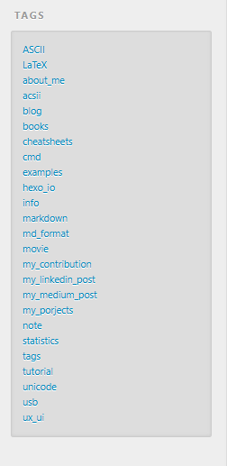
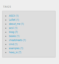
Show some number of tags in the ‘Tag’ section.

Before changes of content of themes\landscape\layout\_widget\tag.ejs file was

1
2
3
4
5
6
7
8
<% if (site.tags.length){ %>
<div class="widget-wrap">
<h3 class="widget-title"><%= __('tags') %></h3>
<div class="widget">
<%- list_tags({show_count: theme.show_count}) %>
</div>
</div>
<% } %>

and
hexo.editing tag section on UI before changes

after changes of content of themes\landscape\layout\_widget\tag.ejs file ‘Tags’ section shows 10 tags only

1
2
3
4
5
6
7
8
9
10
11
12
<% if (site.tags.length){ %>
<div class="widget-wrap">
<h3 class="widget-title"><%= __('tags') %></h3>
<div class="widget">
<% site.tags.sort('name').limit(10).each(function(tag) { %>
<li>
<a href="<%= url_for(tag.path) %>"><%= tag.name %> (<%= tag.length %>)</a>
</li>
<% }); %>
</div>
</div>
<% } %>

and

hexo.editing tag section on UI after changes

Turn on/off Tags is possible in _config.yml,

1
2
widgets:
- tag